
My Consumers - Credit Union Digital Rebrand
Rebuilding structure, clarity, and modern credibility to a growing regional financial institution through a comprehensive website redesign.
Industry Vertical:
Finance & Insurance
Rebuilding structure, clarity, and modern credibility to a growing regional financial institution through a comprehensive website redesign.

Consumers Credit Union is a $4B+ regional credit union serving over 275,000 members across the Midwest. Amid rapid growth and recent acquisitions, the organization invested in modernizing its digital experience to better support scale, visibility, and member service.
Redesign the website to support a growing regional credit union entering a new phase of scale and acquisition. Consolidate fragmented content, improve structural clarity, strengthen compliance and SEO, and elevate the brand’s digital credibility, all while reinforcing a member-first experience grounded in trust, accessibility, and support.
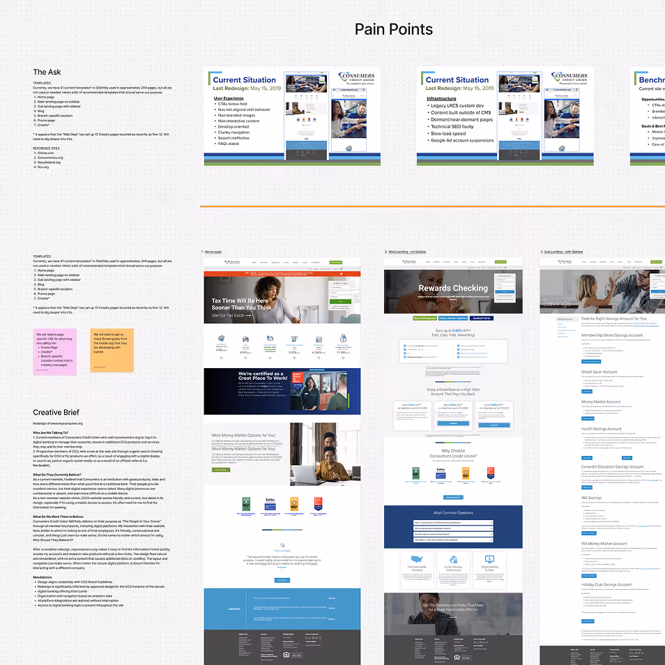
We began with collaborative workshops focused on the existing sitemap and content ecosystem. Rather than assuming what needed to change, we mapped the current experience together, identifying redundancies, friction points, and opportunities to simplify.
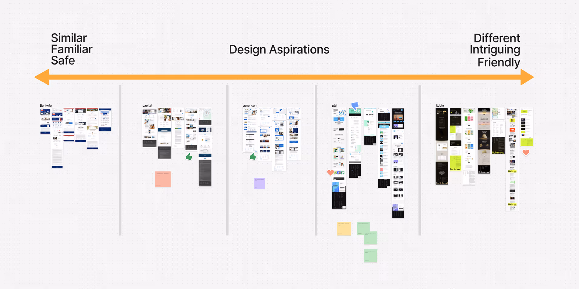
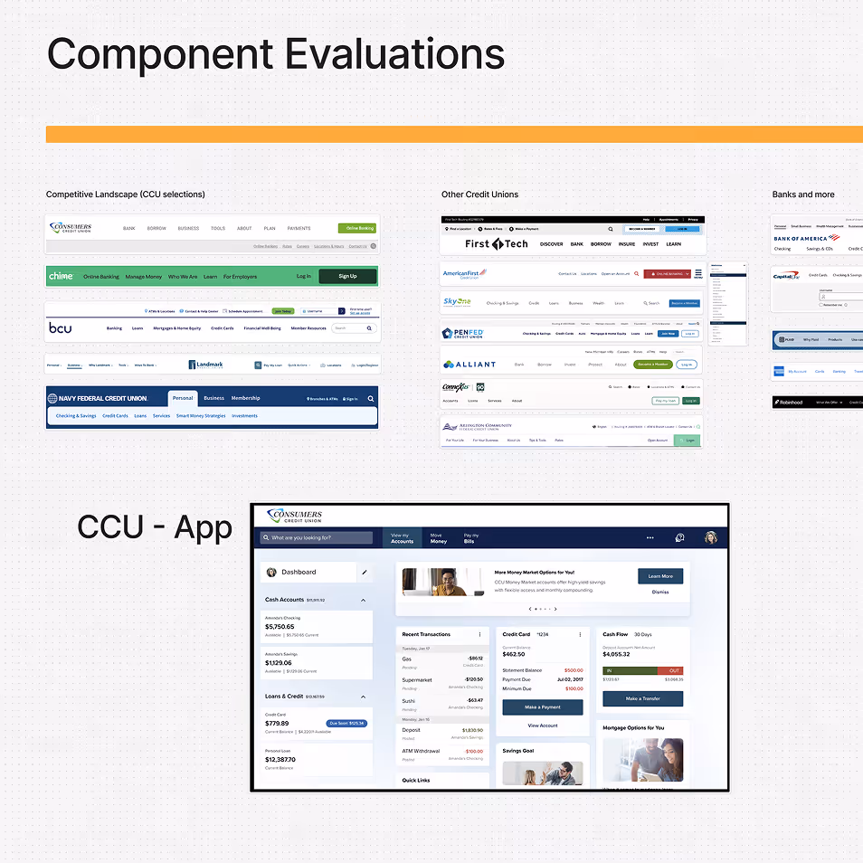
Competitive analysis played an important role. We evaluated aspirational financial brands to understand where CCU wanted to position itself, modern, credible, confident — while also gauging stakeholder comfort with aesthetic risk. The goal wasn’t to chase trends, but to define a visual and experiential direction that felt elevated without feeling unfamiliar.
Using Figma and FigJam, we facilitated working sessions, gathered feedback early, and pressure-tested structural and visual ideas before moving into formal design concepts. This early alignment created momentum and reduced ambiguity later in the process.
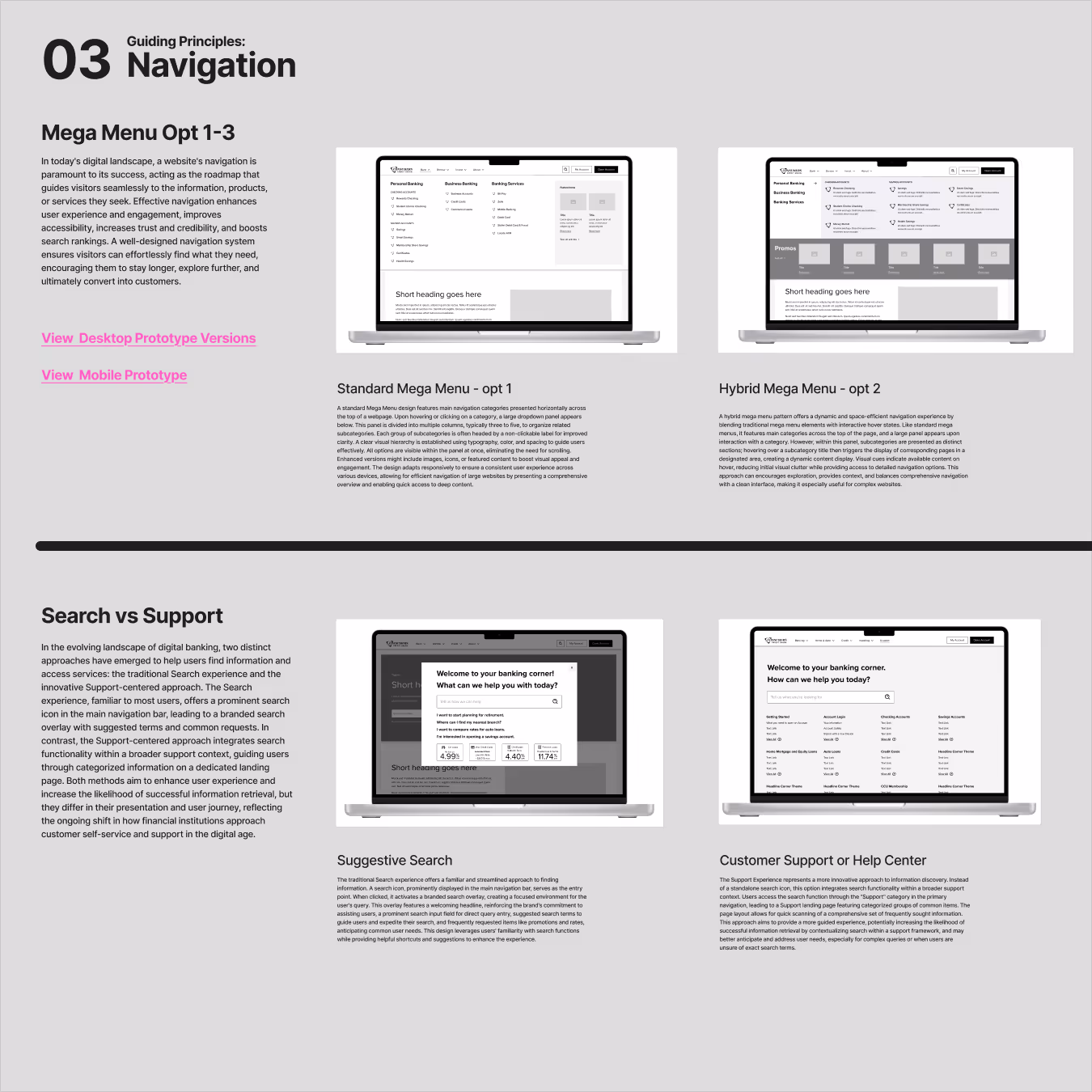
Three principles guided the redesign:
1. Clarify Before Beautify
Structure and hierarchy would lead visual expression not the other way around.
2. Reduce Depth, Increase Comprehension
Where appropriate, related content would be consolidated into more comprehensive pages to reduce unnecessary navigation layers.
3. Support Over Search
Information should be surfaced proactively, not hidden behind generic search results.
These principles created a framework for design decisions that extended beyond aesthetics, shaping navigation, page composition, and content strategy.

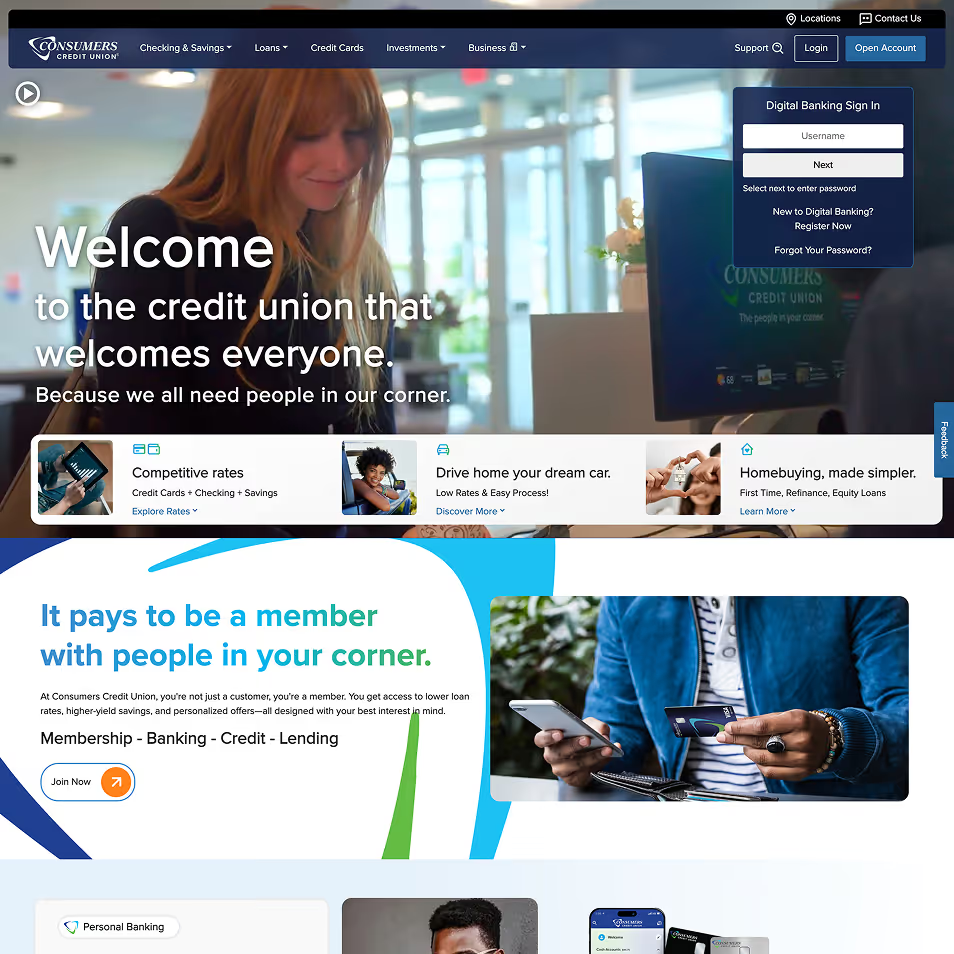
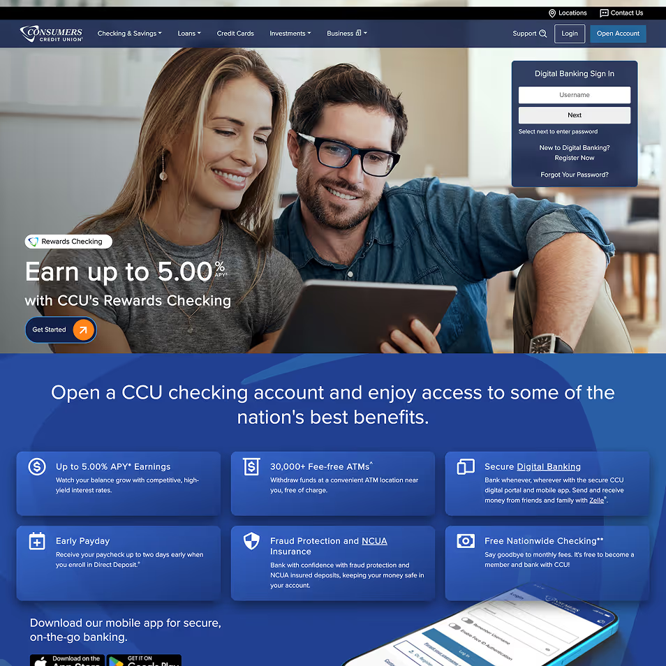
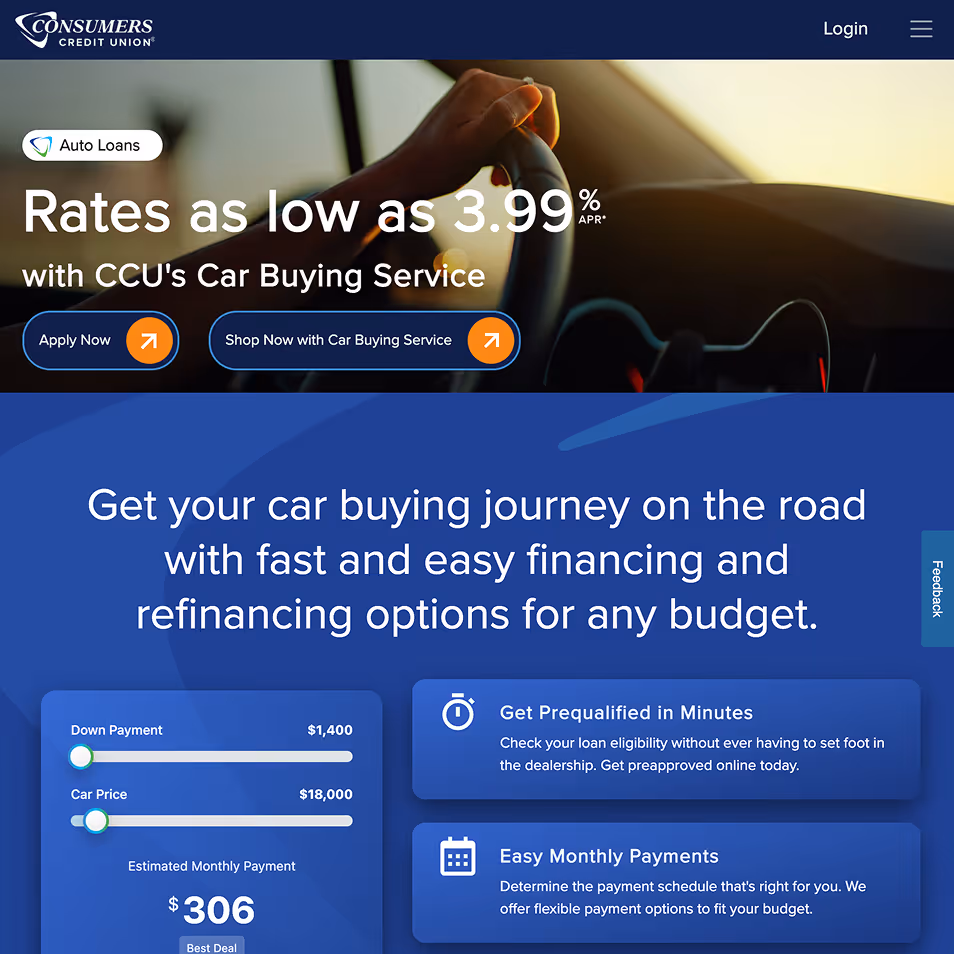
The July 2024 relaunch delivered a modernized, structured, and scalable digital experience aligned with CCU’s growth trajectory.
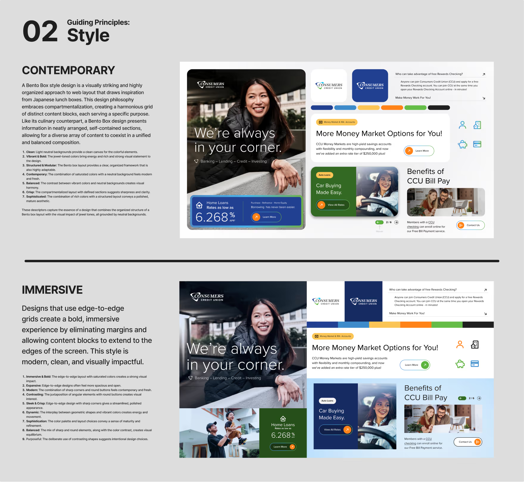
The visual system introduced greater consistency, stronger typographic hierarchy, and a more confident layout language aligning the brand with larger financial institutions while preserving warmth and approachability.
Navigation was simplified where possible, and key pathways were clarified to reduce friction for existing members.
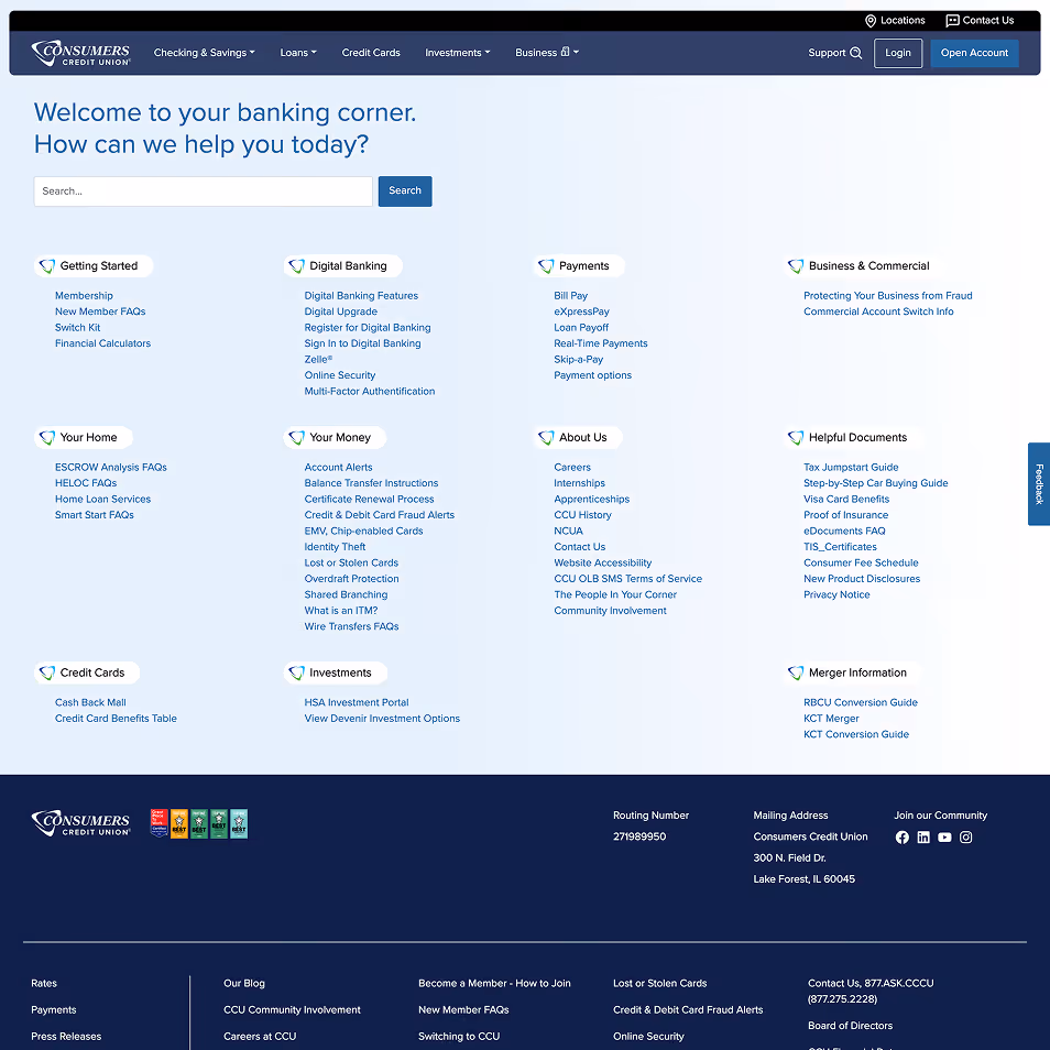
The most meaningful shift in the redesign happened within the Support experience.
Rather than relying on a traditional search-first model, the new Support section was reimagined as a structured resource center organized, scannable, and anticipatory. Instead of forcing members to recall exact terminology, the experience surfaces categorized guidance immediately, allowing users to recognize and navigate toward what they need.
Content is grouped under clear thematic clusters, from Digital Banking to Payments to Home Ownership, reducing cognitive load and improving information scent. A prominent search bar remains available for direct queries, but it now works in tandem with structured browsing rather than replacing it.
This hybrid model supports both behaviors:
The shift was enthusiastically embraced by internal teams. It wasn’t just a UX upgrade, it embodied CCU’s brand promise of being “The People in Your Corner.” Support became proactive, visible, and reassuring, not hidden behind a query field.
From a technical standpoint, the structured layout also strengthens SEO and Generative Search Optimization (GSO), making helpful content more indexable and AI-discoverable, future-proofing the experience for evolving search behaviors.
If you're working on something that needs clarity, care, and momentum, let's talk.
Send a message or call:
p: 404 333-4171


