SEI - Financial Technology

Modernizing legacy finance reporting through systemic design. A comprehensive digital overhaul focused on merging fragmented legacy products into a streamlined modern platform.

Industry Vertical:
Finance & Insurance
Role & Expertise:
Art & Creative Direction
B2B Portals
Design Systems
Finance & Investments
Product Design
Prototyping
Reporting & Client Mangement
UX/UI Design
Web Design

Company Profile

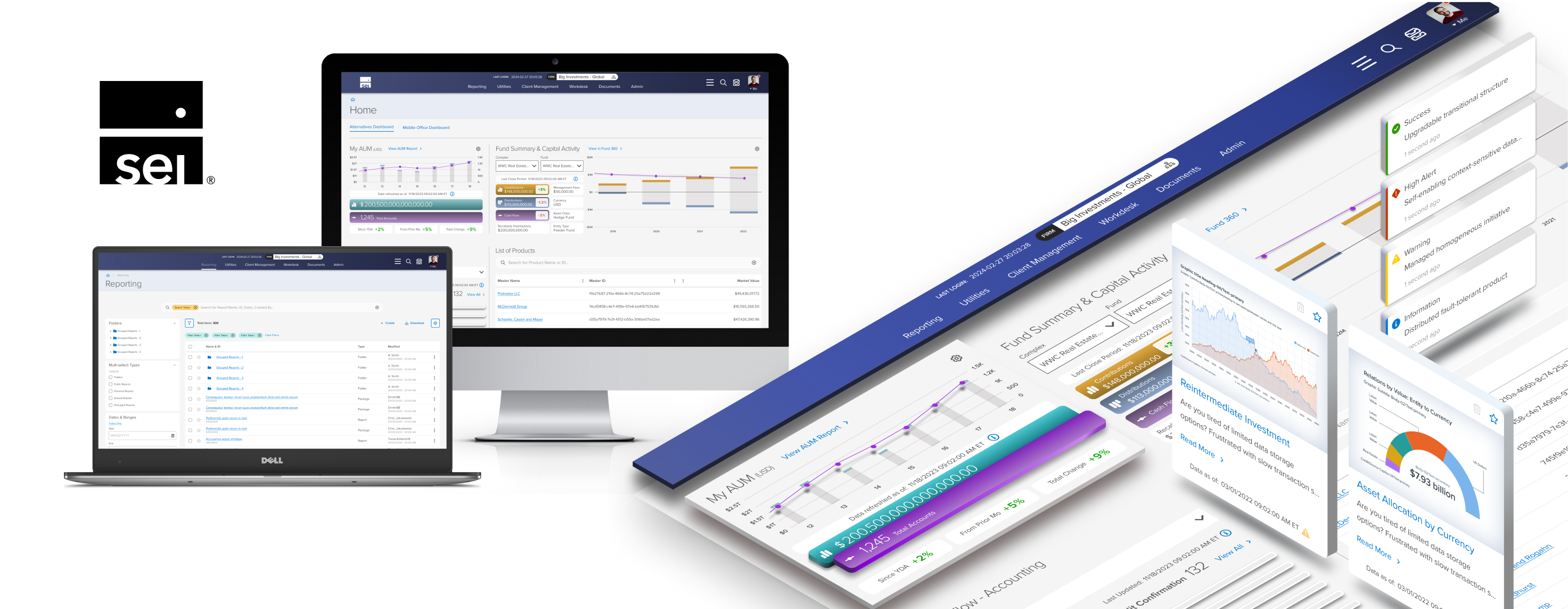
SEI is a global leader in financial technology and investment solutions, managing or administering over $1.3 trillion in assets. With a 50-year legacy of innovation, the firm sits at the center of the financial ecosystem, providing the critical infrastructure that powers asset managers, banks, and wealth management firms worldwide.

CLient
Brief

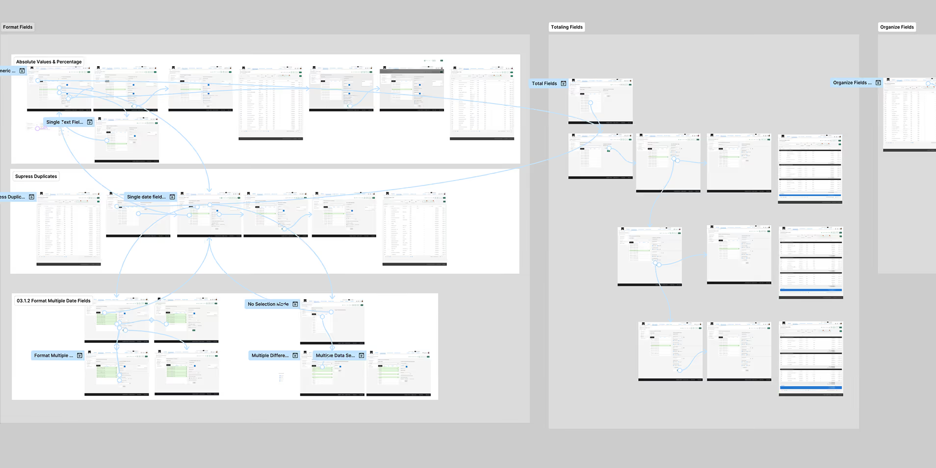
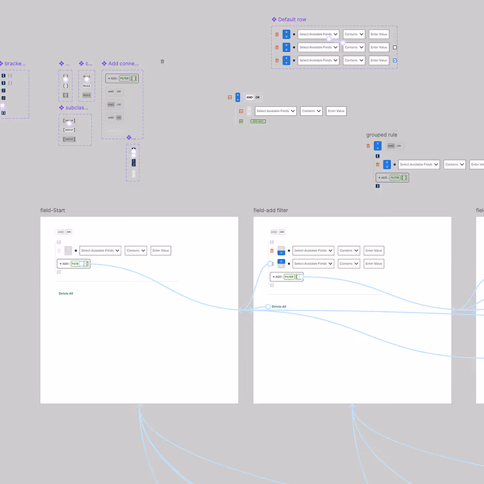
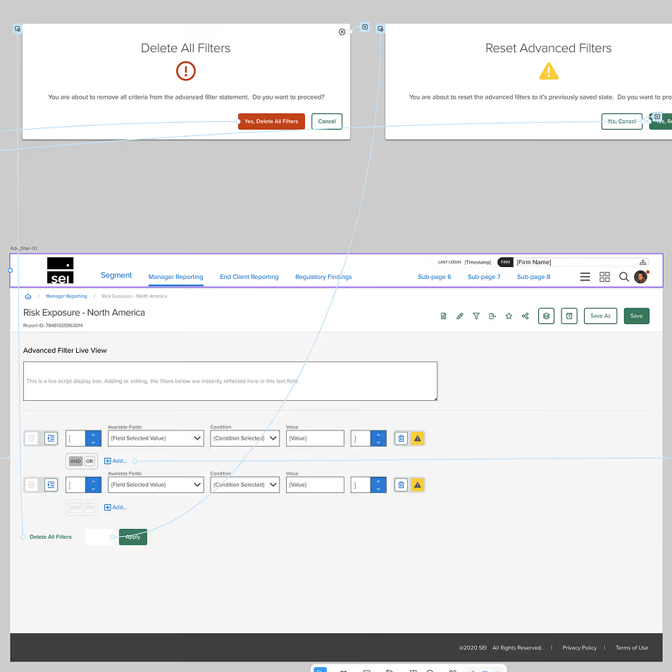
Architecturally and aesthetically merge multiple fragmented legacy systems into a streamlined, modern wealth management platform. The goal was to eliminate technical debt and "application-level" silos by creating a unified system-level experience. This required a robust Design System and a custom Angular component library to accelerate development speed while maintaining a high standard of visual and functional consistency.

Timeline range

2022 - 2024

Role

Creative Direction, UX/UI Strategy, Lead Product Designer

Discovery

Strategy in a High-Security Environment

Modernizing a platform of this scale required navigating complex data privacy and security protocols. Because the live systems contained sensitive financial data, our discovery process was designed to be non-intrusive yet deeply analytical. We relied on "guided walkthroughs" and stakeholder demos to map the ecosystem from the outside in.

  • Reconstructing the Workflow: Since direct access to live client data was restricted, we used collaborative sessions to document user paths. We translated complex demos into detailed workflow maps and schematic drawings, ensuring every edge case was captured before moving into design.
  • Advocating for the End-User: Working within a large corporate structure meant the feedback loop often lived with internal product owners. My role was to synthesize that internal expertise with industry best practices, ensuring the final product would meet the high expectations of the global advisors who use SEI's tools every day.

Solution

Prototyping as Diplomacy

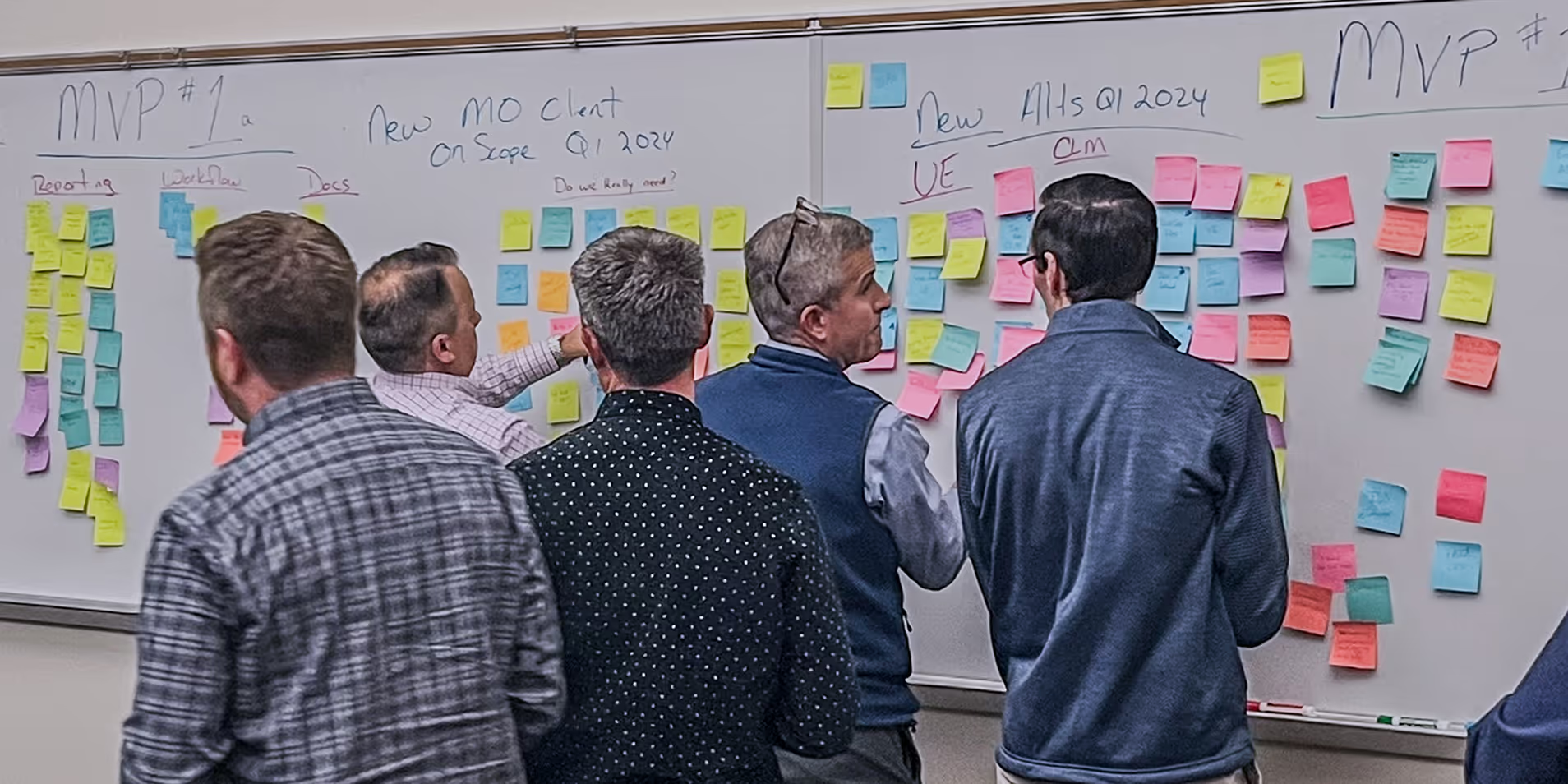
In a high-security enterprise environment, introducing systemic change requires building trust across departments. We moved away from static handoffs and toward a collaborative, prototype-driven process that focused on technical feasibility and long-term scalability.

  • Iterative Alignment: To help the development and product teams visualize the path forward, we used Figma to build high-fidelity prototypes that mirrored real-world complexity. This allowed us to test and validate UX improvements in a safe environment, gathering internal feedback and refining the experience long before production.
  • The Component Bridge: To ensure a smooth rollout, we developed an Angular-based component library. By providing the development team with pre-tested, accessible UI elements, we reduced implementation friction and ensured the new design language was applied consistently across the entire platform.

Process & Design

Bridging Design and Development

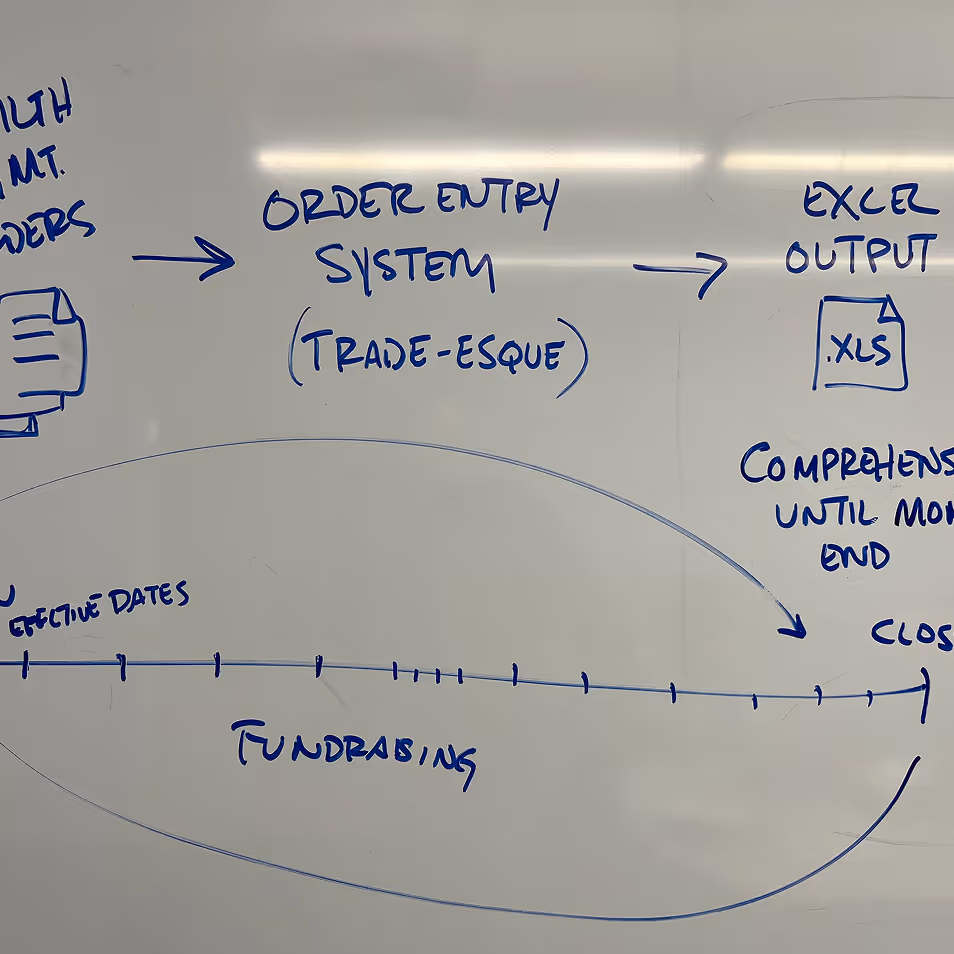
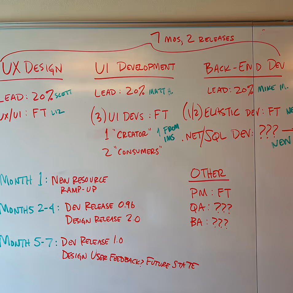
To ensure our designs were technically viable within SEI's infrastructure, we integrated our workflow directly with their development environment.

  • The Single Source of Truth: We utilized a CRM-integrated platform to act as the definitive anchor for the project, syncing approved Figma components directly with the front-end.
  • Collaborative Continuity: This integration enabled the CX team to focus on high-level wireframing and new feature development, knowing that the structural continuity was already being managed at the system level.

The Design System

Scalability through Consistency

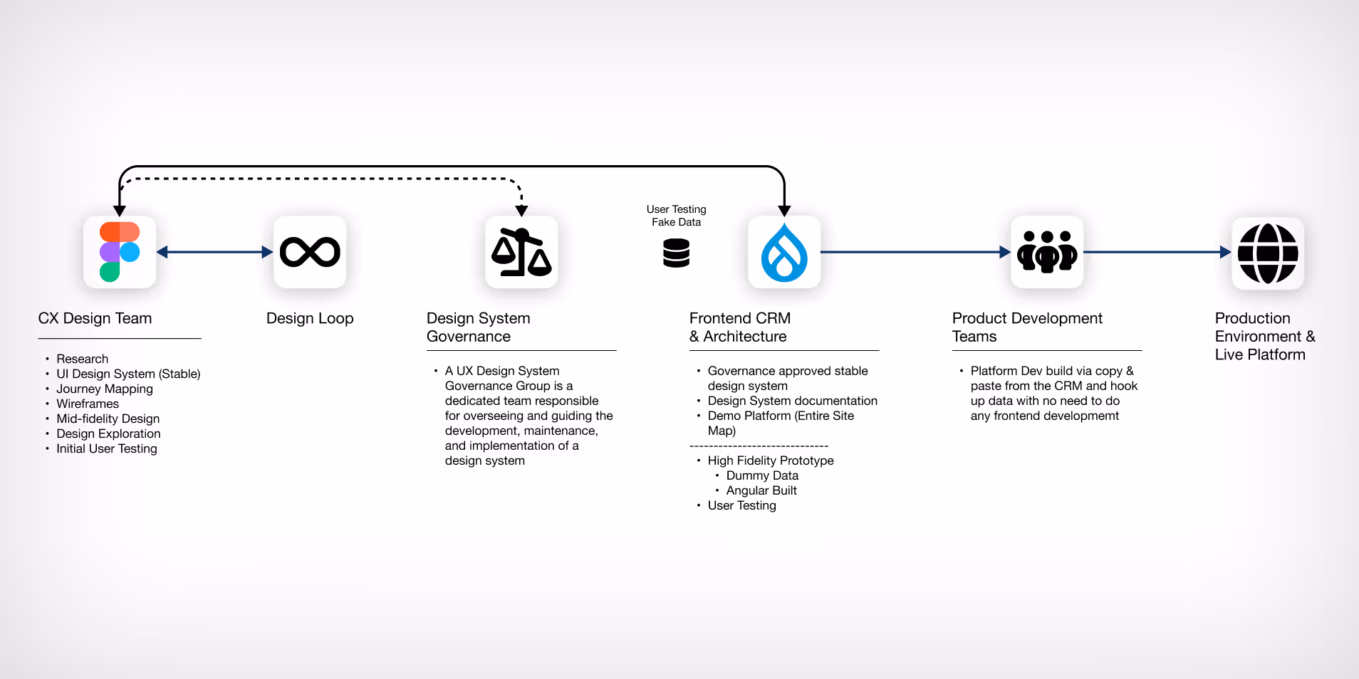
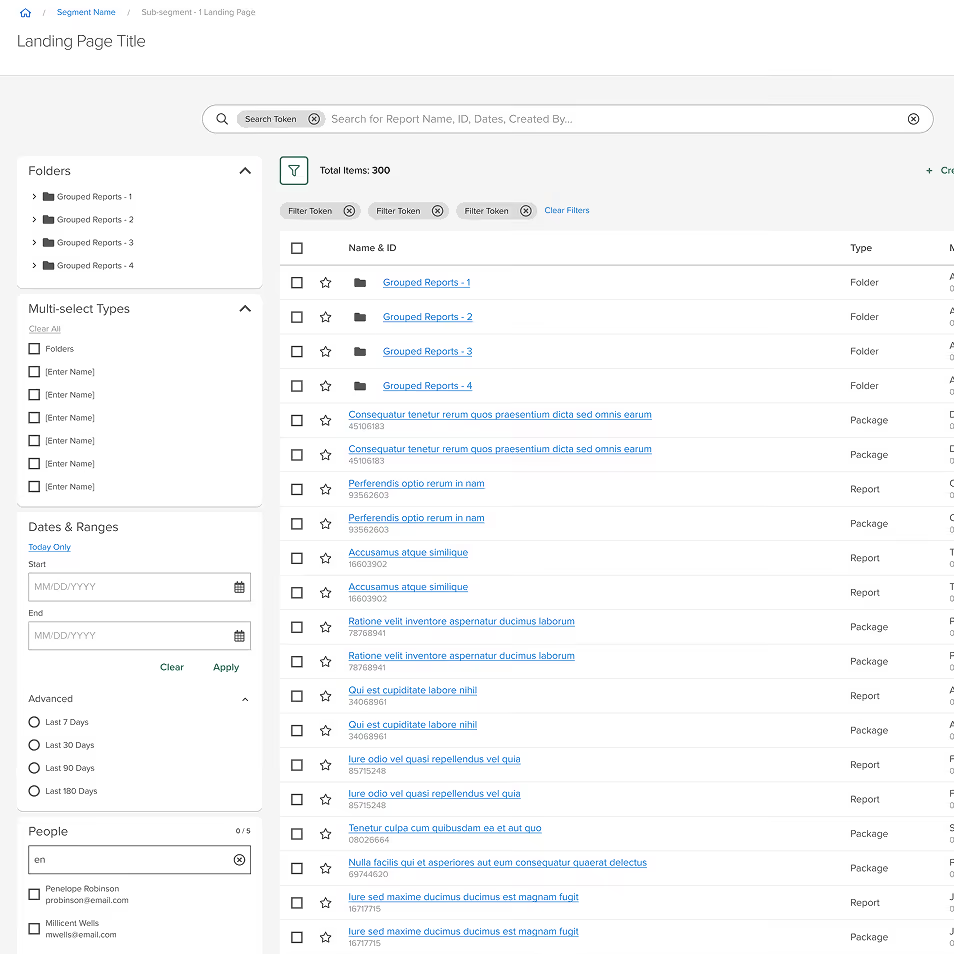
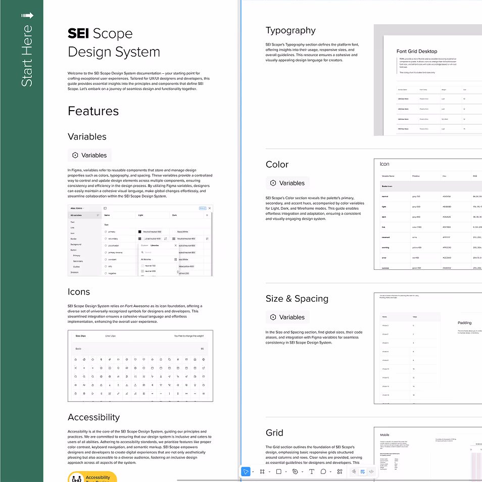
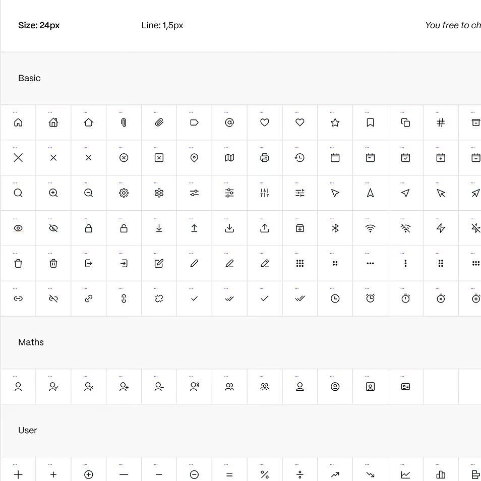
The core of this transformation was a centralized repository of visual and functional components, designed to foster a culture of efficiency across SEI's digital platforms.

  • Foundations & Variables: We established a robust set of design tokens—typography, color, and spacing—to ensure a uniform look and feel across all legacy applications.
  • Accessibility-First Engineering: Accessibility was built into the system from the ground up, rather than added as an afterthought. We ensured every component met WCAG 2.1 standards, focusing on color contrast ratios, screen-reader compatibility, and keyboard navigation to support the diverse needs of global financial advisors.
  • Functional Library: The system provides a toolkit of pre-vetted, accessible components that empower teams to build cohesive, compliant experiences significantly faster.

Contact

If you're working on something that needs clarity, care, and momentum, let's talk.

Send a message or call:

p: 404 333-4171

Thank you! Your message has been received!
Oops! Something went wrong while submitting the form.